Imagine being able to predict the future of a stock market trend just by glancing at a series of visual cues. It might sound like something out of a sci-fi novel, but with candlestick charts, this notion isn’t far from reality. These intricate visual tools have been used for centuries by traders to unlock patterns and insights into market behavior, making them an essential weapon in the arsenal of any budding investor. If you’ve ever felt overwhelmed by the sheer complexity of financial charts, you’re not alone. But today’s your lucky day—this beginner’s guide to candlestick charts is about to transform your trading experience.
Candlestick charts are not just another method of plotting numbers on a graph; they are vivid stories etched in time, each candle narrating the market’s emotional journey. More than just pretty visuals, these charts offer crucial data regarding the opening, closing, high, and low prices within a specific time frame. By understanding these fundamental concepts, you can make informed decisions, minimize risks, and seize opportunities that others might overlook. Whether you’re a novice trader or simply curious about financial markets, this guide will demystify the process, providing you with the foundational knowledge needed to navigate the world of candlestick charts with confidence and ease. Get ready to unlock financial insights and take control of your trading future!
The Origins of Candlestick Charts: A Historical Overview
Candlestick charts have a rich history that dates back to 18th century Japan. They were originally used by rice traders to track the price fluctuations of rice in the Osaka market. The creator of these charts, Munehisa Homma, was a legendary trader who made a fortune using his unique approach to analyzing market trends.
Homma discovered that there was a relationship between price and market psychology. He realized that by studying the emotions and sentiments of traders, he could predict future price movements. This insight led him to develop the candlestick charting technique, which revolutionized the way traders analyzed financial markets.
Initially, candlestick charts were drawn by hand on rice paper. Each candle represented a specific time period, such as a day or a week, and depicted the opening, closing, high, and low prices for that period. Over time, these charts became more widely adopted in Japan and eventually spread to other parts of the world.
In the 1980s, Steve Nison introduced candlestick charts to Western traders through his book “Japanese Candlestick Charting Techniques.” This book popularized candlestick analysis in the West and sparked a renewed interest in this ancient charting method.
Anatomy of a Candlestick: Understanding the Basics
Before diving into complex patterns and strategies, it’s essential to understand the basic components of a candlestick. Each candle consists of two main parts: the body and the wick (or shadow).
The body represents the price range between the opening and closing prices for a given time period. If the closing price is higher than the opening price, then the body is typically colored green or white to indicate bullishness. Conversely, if the closing price is lower than the opening price, the body is usually colored red or black to signify bearishness.
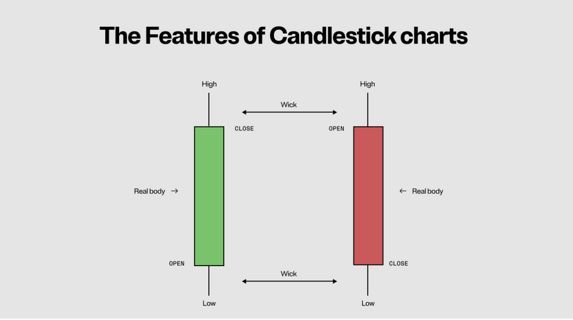
The wick, on the other hand, represents the price range between the high and low prices. It extends above and below the body, resembling a wick on a candle. The upper wick shows the highest price reached during the time period, while the lower wick indicates the lowest price.
By analyzing these components, traders can gain insights into market sentiment and potential price movements. For example, a long green candle with a small upper wick suggests strong buying pressure and bullishness in the market. Conversely, a long red candle with a small lower wick indicates significant selling pressure and bearishness.
Bullish vs. Bearish Patterns: Recognizing Market Sentiment
One of the primary purposes of candlestick charts is to identify market sentiment – whether it’s bullish (upward trending) or bearish (downward trending). By recognizing these patterns, traders can make more informed decisions about when to buy or sell.
There are several key bullish and bearish patterns that traders commonly look for in candlestick charts. Bullish patterns indicate potential upward reversals or continuations in price trends, while bearish patterns suggest potential downward reversals or continuations.
Some common bullish patterns include:
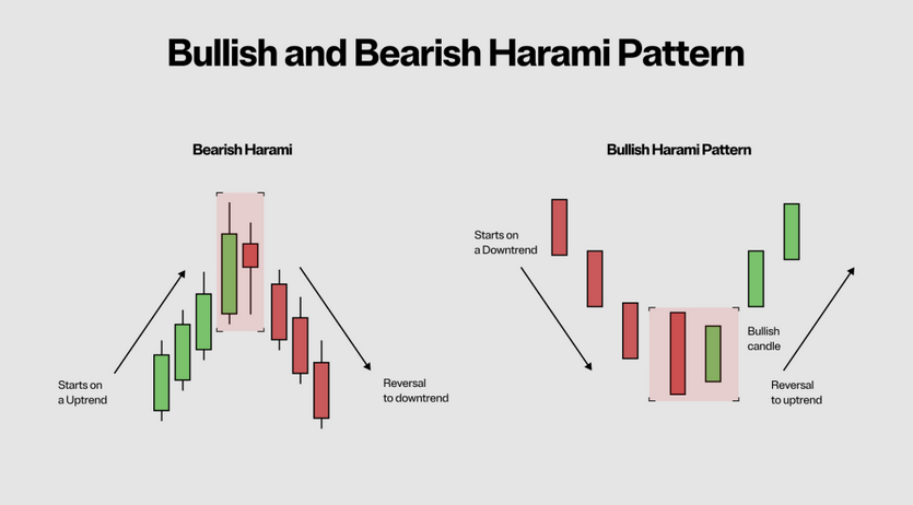
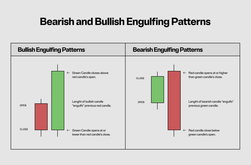
- The Hammer: This pattern has a small body with a long lower wick and little to no upper wick. It suggests that buyers have stepped in after a downtrend, potentially signaling an upcoming reversal.The Bullish Engulfing Pattern: This pattern occurs when a smaller red (bearish) candle is followed by a larger green (bullish) candle that completely engulfs it. It indicates strong buying pressure and potential trend reversal.
On the other hand, some common bearish patterns include:
- The Shooting Star: This pattern has a small body with a long upper wick and little to no lower wick. It suggests that sellers have entered the market after an uptrend, potentially signaling an upcoming reversal.The Bearish Engulfing Pattern: This pattern occurs when a smaller green (bullish) candle is followed by a larger red (bearish) candle that completely engulfs it. It indicates strong selling pressure and potential trend reversal.
Recognizing these patterns is just the first step in using candlestick charts effectively. Traders must also consider other factors such as volume, trendlines, and support/resistance levels to confirm their analysis and make informed trading decisions.
Single Candlestick Patterns: Unveiling Potential Price Movements
Single candlestick patterns provide valuable insights into potential price movements based on the characteristics of individual candles. These patterns can indicate whether buyers or sellers are in control and can help traders anticipate future market trends.
One example of a single candlestick pattern is the Doji. A Doji occurs when the opening and closing prices are very close or equal, resulting in a small or nonexistent body. This pattern suggests indecision in the market and often precedes significant price movements.
Another single candlestick pattern is the Spinning Top. A Spinning Top has a small body with upper and lower wicks of similar length. It indicates uncertainty in the market, with neither buyers nor sellers having full control.
These single candlestick patterns are just two examples of how individual candles can provide valuable information about market sentiment and potential price movements. By studying these patterns, traders can gain insights into supply and demand dynamics and make more informed trading decisions.
Multiple Candlestick Patterns: Interpreting Complex Formations
While single candlestick patterns can provide valuable insights, multiple candlestick patterns offer a more comprehensive view of market dynamics. These patterns involve a series of candles that form specific shapes or formations, indicating potential trend reversals or continuations.
One example of a multiple candlestick pattern is the Three White Soldiers. This pattern consists of three consecutive long green candles with little to no upper wicks. It suggests a strong uptrend and indicates that buyers are in control.
Conversely, the Three Black Crows is a bearish multiple candlestick pattern. It consists of three consecutive long red candles with little to no lower wicks. This pattern suggests a strong downtrend and indicates that sellers are in control.
These are just two examples of multiple candlestick patterns that traders use to interpret complex formations and make predictions about future price movements. By understanding these patterns, traders can gain an edge in the market and increase their chances of success.
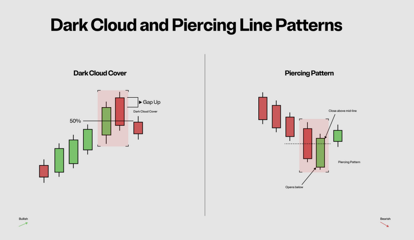
Common Candlestick Patterns: Identifying Key Signals
In addition to single and multiple candlestick patterns, there are several common candlestick patterns that traders frequently encounter in financial markets. These patterns have been extensively studied and documented, making them valuable tools for identifying key signals and making informed trading decisions.
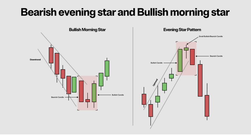
One common pattern is the Morning Star, which consists of three candles: a long red (bearish) candle, followed by a small-bodied candle (either bullish or bearish) that gaps down from the previous day’s close, and finally a long green (bullish) candle that engulfs the previous two candles. This pattern suggests a potential trend reversal from bearish to bullish.
The Evening Star is the opposite of the Morning Star and indicates a potential trend reversal from bullish to bearish. It consists of three candles: a long green (bullish) candle, followed by a small-bodied candle that gaps up from the previous day’s close, and finally a long red (bearish) candle that engulfs the previous two candles.
These common candlestick patterns are just a few examples of the many signals that traders can use to identify potential trend reversals or continuations. By familiarizing themselves with these patterns, traders can gain a deeper understanding of market dynamics and make more informed trading decisions.
Using Candlestick Patterns in Trading Strategies
Now that you have a solid understanding of candlestick charts and common patterns, it’s time to explore how you can incorporate this knowledge into your trading strategies. Candlestick patterns can be used in various ways, depending on your trading style and risk tolerance.
One popular strategy is trend following, where traders look for bullish or bearish patterns that confirm the prevailing trend. For example, if the overall trend is upward, traders may look for bullish patterns as potential entry points to buy. Conversely, if the overall trend is downward, they may look for bearish patterns as potential entry points to sell.
Another strategy is reversal trading, where traders look for candlestick patterns that suggest potential trend reversals. These patterns often occur at key support or resistance levels and can provide valuable entry or exit signals.
In addition to these strategies, some traders use candlestick patterns in conjunction with other technical indicators such as moving averages or oscillators to confirm their analysis and increase their chances of success.
Pitfalls to Avoid When Analyzing Candlestick Charts
While candlestick charts offer valuable insights into market behavior, there are some pitfalls that traders should be aware of when analyzing these charts.
One common mistake is over-reliance on individual candlestick patterns without considering other factors. While single candlestick patterns can provide valuable information, they should be used in conjunction with other technical analysis tools to confirm their validity.
Another pitfall is ignoring the overall trend of the market. Candlestick patterns should always be interpreted in the context of the prevailing trend. A bullish pattern may not be as reliable if it occurs in a strong downtrend, and vice versa.
Lastly, it’s important to remember that candlestick patterns are not foolproof indicators of future price movements. They provide probabilities and insights into market sentiment, but there is always a degree of uncertainty in financial markets.
Advanced Tips for Mastering Candlestick Chart Analysis
Once you have mastered the basics of candlestick chart analysis, there are several advanced tips that can further enhance your trading skills:
1. Combine candlestick patterns with other technical indicators: By using multiple indicators, you can increase the accuracy of your analysis and reduce false signals.
2. Use different time frames: Analyzing candlestick charts across different time frames can provide a more comprehensive view of market dynamics and help identify long-term trends.
3. Practice risk management: Always use proper risk management techniques such as setting stop-loss orders and managing position sizes to protect your capital.
4. Keep learning: Financial markets are constantly evolving, so it’s important to stay updated with new candlestick patterns and trading strategies.
Conclusion: Empowering Your Trading Journey
Candlestick charts are powerful tools that can unlock valuable insights into market behavior and help traders make informed decisions. By understanding the origins of these charts, the anatomy of a candlestick, and various bullish and bearish patterns, you can gain an edge in the financial markets.
Remember to use candlestick patterns in conjunction with other technical analysis tools and consider the overall trend of the market. Avoid common pitfalls and continuously refine your skills through practice and learning.
With this beginner’s guide to candlestick charts, you now have the foundational knowledge needed to navigate the world of financial markets with confidence and ease. Unlock financial insights, seize opportunities, and take control of your trading journey!
financial for beginners: The Ultimate Guide
what is Technical Analysis? A Beginner’s Guide to Market Insights
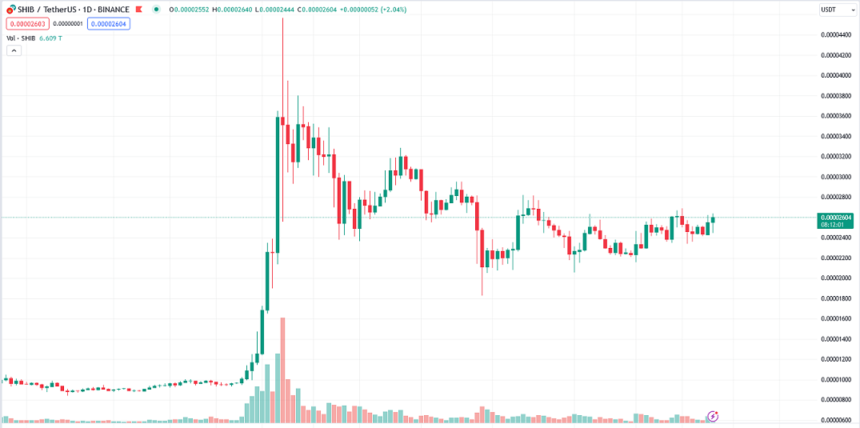
The images of the charts posted in the text are extracted from the site and the link below: